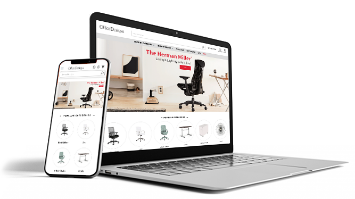

eCommerce Website Design Optimization Pays Off with Increased Revenue

There’s no underestimating how important design optimization is for an eCommerce website. Leaving any of the most important elements of web design to chance for an eCommerce website ends up costing in terms of lost revenues and profits. The concept of design optimization is actually simple. A fully optimized eCommerce website will deliver the maximum amount of positive results.

icon-bullet-gear-minSimplified Navigation Results in Increased Sales

If you’ve ever been to a big box retailer to find one item in a hurry, you understand the need for simplified navigation for an eCommerce website. Shoppers are the same, whether they’re looking for products offline or online. The faster they’re able to find what they want, the more satisfactory they find the shopping experience. Happy clients come back for more and spend more per visit.

Modern eCommerce websites employ these navigation aids:

    • Menus – Menus are the bread and butter navigational aids on a website. Take your time when deciding on the type of menu you want to use. Hidden (or Hamburger) menus have grown in popularity, along with mobile device usage, because you will probably hide many items unless a visitor specifically requires them.
    • Filters – Filters add real power to your navigational system. They allow visitors to sort your inventory based on the criteria that’s most important to them. Giving website visitors the ability to filter their results based on type, price, or any other selection criteria they deem useful are rewarded with increased sales. Customers who land on your website have a good idea about their budget and other requirements, so it pays to make it easy for them to sort your results fast.
    • Search – Search is a standard navigational aid that allows a visitor to bypass traditional menus in favor of directly finding a product. Search allows your visitors to quickly find the exact product they’re looking for, which is exactly what they want to happen.

All of these navigation aids have been added for the sole purpose of making products easy to find. For eCommerce websites with enormous inventories, this is amazingly important. One nice thing about managing an eCommerce website is that you have control of all the analytics that are generated. Review your log files and analytics programs to gain a deep insight into how users navigate your website. Discover which pages are most popular and change your navigation as necessary. This gives you the ability to “double down” on early successes. Your navigation is a powerful tool for making sales. Continue to monitor and improve it whenever possible to maximize sales.

quote1-the-faster-theyre-able-min

icon-bullet-gear-minPut the Spotlight on Your Bestselling Products

It’s no secret that customers are motivated by popularity. They figure if a product is already highly rated and popular among a large group of people, chances are high they’ll like it themselves, too. That’s why savvy eCommerce website operators tend to highlight bestselling products on the home page. It also helps to offer best sellers in categories. People who are researching products appreciate being exposed to items that have proven their worth with a large variety of people. Out of gratitude, they tend to buy.

image1-otc-wholesale-min

icon-bullet-gear-minImplement a Content Marketing Strategy to Boost Sales

Using content marketing strategies to boost your sales is a smart idea. Your video, images, or text content is usable in a number of ways, which helps inform and persuade your visitors to make purchases. How you use content is up to you. Creating content that is to be used on the website, as well as content that is placed externally, are both viable methods to improve engagement. These days, video content is extremely popular, especially when it’s used to clearly communicate key points of product differentiation. Some marketers have also found great success using content that shows customers “how to” solve specific problems using their products. The extent of your content creation strategy will rely heavily on your budget.

Keep in mind that the concept of “content saturation” is proliferating. People have seen many of the same types of articles and videos many times before. You probably are better served to try to take as unique of an angle as possible on any subject you attempt. If you create content for external marketing purposes, you’ll want it to be the type of content that is shared widely. This rarely happens with dry or repetitive material. If you don’t feel you’re up to the task of creating this type of highly engaging content, but your budget supports its, outsource it to talented creators.

icon-bullet-gear-minBe as Detailed as Possible with Your Product Views

Imagine a potential customer who lands on a product page on your website. Have you provided this person with the absolute maximum amount of information you’re able to muster? The answer better be “yes!” Landing on a product view is the “moment of truth” that will either make the sale or break it. Customers who are distracted by the need to do additional research off that page are likely not to return. It’s likely that they’ll be poached by a rival site that satisfies their query. As the old saying goes, “you never have a second chance to make a first impression.” ECommerce is highly competitive, and you are always best served to help customers buy from you by providing them with everything they need to know.

Populate your product views page with pertinent information, such as:


    • Specifications – Detailed product specifications are a must. Customers need to know about size, voltage requirements, and other important specifications to make informed purchasing decisions. If they’re unable to find a crucial bit of information, they won’t buy. Supply them with everything, and, by doing so, get the sale more times than not.
    • Ratings – Ratings from other customers, and awards from industry leaders, are information that people want to know about. Highly rated products do better than ones that are unloved. Provide all positive and negative information you have and let the buyer decide.
    • Reviews – Reading reviews is a passion for millions of online shoppers. Reviews reveal insights into products from existing customers. For example, a person who is larger than average may say that a mattress is fit for heavier people based on her personal experience. For someone who comes along later, this type of information is absolutely golden. It saves them having to contact the company to answer a question that has already been answered with a review. People who give negative reviews also explain exactly what it is they didn’t like. Customers may decide those factors are not as important to them, but the additional information helps inform their decision.
    • Terms – All terms of the sale should be clearly displayed on the product’s view page. All information about shipping or other important policies has to be included to make a complete page.

    • Extended description – Descriptions should contain crisp, clean copy that details all the reasons people should purchase the product, as well as containing an accurate description. Extended descriptions are valuable real estate that allow you point out all the benefits incurred by buying the product.

Product view pages are the last destination before a purchase. Consider these as your last, best chance to persuade visitors. If you have any pages that already do quite well, pay careful attention to how they’re structured and what details they have. Don’t be afraid to use the same type of details going forward. If you have product pages that do poorly, bulk them up and track conversions. Keep tweaking until you start seeing the kind of numbers you salivate over.

quote2-landing-on-a-product-min

icon-bullet-gear-minLarge Responsive Designs Are Great Assets

It’s no secret that mobile devices have taken over from alternative access types. People using tablets and phones to visit your website are now the majority of visitors. Bold, large responsive web designs have been proven to capture visitor attention and create an engaging experience that is conducive to making sales. You’ve probably noticed the proliferation of wide, full-screen responsive designs on sites you visit. There’s a reason for this design movement. Conversion tracking shows that larger designs with crisp typefaces do very well with modern web browsers who tend to visit using their mobile device.

These tips should be used to help you deliver an awesome responsive eCommerce website design:

    • Build from a proven template – There are many template repositories that you can build on top of. There are many free CSS templates that are easy to modify. They serve as great beginning points for a full-fledged design. Bootstrap is a robust, mobile-friend framework for frontends that is used by many popular websites. Standing on the shoulders of giants will help you reach the stars with your eCommerce website design.
    • Use flexible images – Context-aware image sizing solves the problem of making sure your images always display correctly. A few lines of CSS code, and your images will snap in place on all sizes of devices.
    • Jquery is an awesome helper – Jquery is used on many websites because it delivers an awesome level of functionality through many “helper” classes that take care of a lot of the heavy lifting that make responsive websites look and function perfectly.
    • Use background images that are scalable – The CSS3 specification makes life easy for web developers who want to use a background image that scales correctly. The “cover” element delivers this functionality easily
    • Test your design constantly – Test all elements of your design constantly. Test using different devices so that you’re sure everything is displaying and functioning just as it should. There are quite a few services online that allow you to check your site across all browsers. Use them so that you’re confident your site is always working just like you expect.

Site design is a hugely important component of the success of any e-v website. Sites that make billions of dollars in sales are functional and good looking. Use sites you admire as inspiration to create your own. Nobody builds designs completely from scratch. Incorporating elements you enjoy from popular websites is a great way for you to design a site you’re proud of.

icon-bullet-gear-minWeb Design and Conversion Optimization Are Intimately Linked

As you build your website, it pays to keep the needs of your users in mind at all times. What’s good for your visitors will be good for your business. Conversion Rate Optimization (CRO) always remains popular, because businesses use this method to gain more revenues without incurring extra expenses. Any time you’re able to convert more of the existing visitors to your site, you increase your profitability. Make it a goal of yours to use CRO as a guiding principle during all phases of your website’s lifecycle.

Conversion rate optimization has three distinct goals:

  • Convert a larger percentage of site visitors into customers.
  • Improve overall user experience for site visitors to generate increased repeat business.
  • Increase both profits and revenues.

Combining CRO with your digital marketing efforts is the perfect way to gain more sales. Testing your traffic sources and conversion pages has never been easier than it is now. Avail yourself of all the various types of tracking that are available, and test everything without harboring any preconceived notions.

icon-bullet-gear-minDon’t Neglect the Important of Great Customer Service

Making it easy for customers to contact you is always a way to improve their experience. A simple form, live chat, or a toll-free phone number are all assets that allow customers to ask any pre-sales questions they have. It also proves to them that you’re around once the sale is made. With so many scams online, it pays to assure people that you’re not one of the bad guys. When a potential client knows that you’re around and easy to deal with, it alleviates many of the worries they may have had. Excellent customer service is always a point of differentiation for eCommerce providers. If all other elements of the comparison are equal, customer service breaks the tie!

image2-strings-and-beyond-min

icon-bullet-gear-minDon’t Forget the Power of Social Media

Integrate your website with social media as much as you possibly can. There’s no doubt that social media channels are now the primary drivers of revenue for eCommerce websites. Represent yourself across as many channels as you can, and make it easy for your visitors to share your content when applicable. People have come to expect friction-less experiences across multiple channels, so be sure to give it to them. You need to monitor your social channels for questions and feedback. Many customers want to speak to you on their favorite networks. Social media marketing requires that you are available to your fans and followers to answer their questions and engage with them on a regular basis.

You should also keep in touch with your customers through email and social media. Collect email addresses and send them offers and news. Make timely updates that let them know you’re still doing business and that you have something they may be interested in. When these efforts are performed consistently over time, they have a major impact on sales. Your customers will forget you if you don’t reach out to them periodically. It doesn’t take much time to update your social media or newsletter. If you don’t have the time or inclination to do it, hire specialists who will do it for you. eCommerce is all about growing your business over time by satisfying as many people as possible. Once you do that, you’ll develop a rhythm that’s literally unstoppable.

eCommerce Essentials: Choosing the Perfect Platform

Ask any business owner, and they’ll tell you that opening up a retail space is a lot of work. Factors like location, floor space, stockroom space, overhead costs, and so on mean that a lot of careful planning and analysis has to come into play. If you can expect such analysis with a physical store, you should certainly expect nothing less when trying to setup an eCommerce platform.

Just like you wouldn’t choose just any retail space for a store location, you shouldn’t choose just any platform to operate your online store from. Figuring out what platform is going to work for your business can be a challenge, especially for those just starting out in business. Here you’ll get a step by step guide to not only understanding the approach you need to make toward eCommerce, but also to how to pick a platform that’s perfectly suited to your business needs.

icon-bullet-squares-minYour Business’s Impact

Before you can start looking through different online platforms, you have to have a very solid idea about what it is you’re wanting to present to your consumers. Having a website isn’t just about selling your products; it’s also about expressing who you are as a business person and what your company represents. Understanding the impression that you want to make with your customers is essential in understanding how you need to design your website.

This understanding will help you figure out the sort of things you’d like to focus on, such as written content, graphic media, videos, and more. How do you want your business’s style to be translated to the consumer? Are you looking for something that’s sleek and professional, or perhaps something that’s a bit more cutting-edge and out of the box?

Details like this are important to figure out, because they’ll give you a better sense of what it is you’re looking for in a platform. Different platforms will offer different features, so you definitely want to know how you’re going to utilize a platform before you make your decision.

icon-bullet-squares-minCosts: Immediate and Long-Term

What you’re able to spend on an online platform is certainly going to play a major role in what you end up choosing. Prices are going to reflect the different features and compatibilities that are offered by a platform, and this is what you really need to pay attention to when it comes to cost.

When you’re comparing the costs of various platforms, you have to be mindful of what comes with higher or lower price tags. One platform may cost 50% or 100% more, but offer far more features and versatility. Again, this is one of those areas where a thorough analysis of what you’re trying to achieve with your online business is going to come in handy.

Some companies will include features that you really need for your particular vision, such as the ability to offer discount codes, set up wish lists, or provide support. Others, however, will offer these features along with an additional price tag.

This is one of the reasons why you need to study the short-term vs. the long-term costs of the platforms you’re considering. Some may cost a little more to purchase, but will save you a lot more money than others that will require you to purchase add-ons in order to maximize your website’s potential. Look for a platform that provides you the ability to offer the most products, visual and descriptive content, and apps for the lowest overall price.

It also pays to be a little bit cautious at first. Find a good platform that offers plenty of features for a reasonable price that won’t break your budget, but don’t opt for a package that comes with what seems like a limitless supply of features just because.

After you get your online shop up and running, you can track the way in which your customers are viewing and buying your products, as well as pay attention to their feedback in order to understand how they’re responding to your content and the various features your site offers.

Once you have a more solid understanding of what your particular demographic is looking for, then you can go back to reevaluate what you want out of your site’s platform. This way, you avoid paying for a bunch of features that customers won’t even use or may find annoying whenever they visit your site.

icon-bullet-squares-minVersatile Viewing

The internet has most certainly revolutionized the way in which we do business in the 21st century, and developing technology is only continuing this revolutionary trend. More and more people today use smartphones and tablets to shop online, but not every site is fully compatible with these devices. This has caused eCommerce businesses to scramble in an attempt to adapt their platform’s compatibility, rather than lose customers to their competitors who have already upgraded their websites.

The use of smartphones and tablets to shop online is no longer a niche market, as it now makes up a large chunk of how people shop online and otherwise access the internet.

Access is another key point to keep in mind. Not only do you need to have a website that’s compatible with a wide range of devices, but you need to be sure that your chosen methods of interacting with customers is fully accessible. This means using social media that’s linked to your website in an effort to create a more genuine rapport with your customer base.

Many websites include a blog section or a link to another platform that features their blog. Either way, this is a smart route that any business should take, ensuring in the process that consumers can access this content no matter what they’re using to get online.

quote1-the-use-of-smartphones-min

icon-bullet-squares-minHosting Options

The way in which you host your new platform is going to be a factor in making your choice between one platform type and another. In order to host a website, you need a server that can act as its base. You can host the site yourself from your own server at home or in a physical store location, or you can purchase a server through a software company that specifically offers such space to businesses looking to host their websites. The difference between hosting a site yourself and hosting it somewhere else boils down to cost, involvement, and security.

Your website is going to have access to a wide array of personal information, including customer’s credit cards. Hosting services offer added anti-virus and anti-malware security, and various encryption services, in order to keep your website safe from hackers. However, you can install anti-virus software of your own and host your website yourself, still maintaining security as long as you routinely update your software and website to make sure it’s free of any possible hack points.

Hosting yourself may also save you more money, depending on the kind of anti-virus software you get and whether or not you want to hire someone specifically to perform online maintenance for you. How much you’re having to spend on hosting is in turn likely to affect the amount of money you’re able to spend on a platform service, so this is a factor you’ll want to have already decided.

icon-bullet-squares-minFlexibility and Quality

You could probably group these two issues in with a platform’s features as a whole, but they deserve some specific attention. When thinking about flexibility, you need to consider not only the products and services you’re going to be offering, but also the sort of content you’d like to share with your site’s visitors.

When analyzing a platform’s flexibility concerning your products, pay attention to the amount of products you’re able to list compared to the price you’re paying for the platform. Also pay attention to the way in which you’re able to present your products.

How many photos are you able to show off different products? How much of a description are you able to give? Will the platform give you the ability to thoroughly categorize your products in a way that will make sense to customers, therefore making it easier for them to shop?

image1-luxe-min

Content flexibility is also extremely important, as this is one of the main ways in which you’re able to connect with your customers. Pay attention to whether or not you’re able to add videos and other graphic content, along with the kinds of links you’re able to incorporate.

For example, you may wish to exhibit moving graphics, images in slideshow formation, or include a news and events page that allows you to post videos and other multimedia content. Even if you’re not thinking of doing this at the moment or just don’t know precisely how you’d like to incorporate various forms of content, it’s a good idea to pick a platform that at least offers some decent flexibility for what you might like to do later down the road.

A website’s quality is every bit as important as what it is you’re selling. After all, the quality of your website has a lot to do with getting customers interested in products and services, and subsequently purchasing from you. You’ll want a platform that’s not only fast but that also offers excellent resolution and download/upload abilities.

Whatever multimedia you’re wanting to showcase on your site needs to have a flawless quality to it, which means pictures shouldn’t be grainy, audio and video shouldn’t lag, and nothing should have a problem quickly uploading.

If you’re offering products or services that require users to download them from your website, then you definitely need to find a platform that will allow for fast downloads; otherwise, your customers are going to feel as if the money they’re paying for what you’re offering just isn’t compatible.

quote2-content-flexibility-min

icon-bullet-squares-minProfessional Help

We’re not all graphic designers or software experts, and while many platforms are fairly straightforward to set up and use, it sometimes pays to have some expert help. Finding a team of designers and managers that can help you get the most out of your platform’s features will go an extremely long way in helping you fully realize the vision you have for your eCommerce business.

Many business owners often find that the platform services they’re using offer many more possibilities than they were aware of, but it took an expert web designer to create the right coding to maximize their website’s potential.

An expert web service can also help you create a plan for the future of your online business by analyzing what your platform is capable of, when and how to convert features and even the platform itself in order to expand your options, and how to reduce site cost and maintenance.

Not sure how to create amazing content for your website? An eCommerce service team can either help you create this content or put you in touch with someone who can, and then help you incorporate this content into your website in a way that makes sense and delivers big impact.

Having an expert group at your disposal can also be a saving grace when it comes to marketing. Your website is like a store and a billboard all in one. The content you’re showing on your website has to create the right sort of brand experience, and promote your products and services in the best way possible.

One of the best things about a development team is that if you just can’t decide on a platform, they’ll be able to analyze your company’s needs and find the platform that fits them. With this in mind, look for a service that not only has plenty of experience to call on, but which also promotes itself as having experience with a variety of online platforms.

This way you’ll know for sure that a lot of the guesswork is going to be taken out of the equation, and you won’t have to worry about ending up with a service that basically helps you pick out a platform through trial and error.

Best Usability Practices for eCommerce Sites

Although good usability is important for every website, it’s especially critical for an eCommerce website. If an eCommerce site isn’t easy for potential customers to use or navigate, it won’t generate as many sales as it would if it were easier for customers.

ECommerce sites are susceptible to becoming overly complex mainly because of the sites’ purposes. Purchasing is a complex process; customers interact with a variety of interfaces involving shopping carts, billing, credit cards, shipping addresses, plus the secure checkout system – and that’s just a few of the features common to most eCommerce sites.

Good usability is a definite requirement for a successful eCommerce site. If a customer can’t complete the purchasing process because it is too long and complicated, or if they don’t feel their personal information is secure, it doesn’t matter if great prices are being offered or if the products are amazing.

When considering usability for eCommerce sites, there are two distinct phases of the shopping process. The first phase is choosing the product, and the second phase is buying it.

Let’s take a look at the first phase – choosing the product.

icon-phase-one-min

Shopping in the Online Store: Taking a Lesson from Hansel and Gretel

You remember that old fairy-tale about the two kids in the woods, Hansel and Gretel? They dropped breadcrumbs behind themselves so they could find their way home.

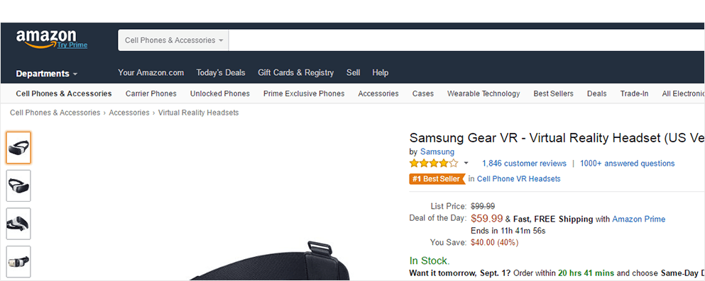
Shopping sites use digital breadcrumbs in the same way. As a customer clicks through different points on a site, a “trail” of digital breadcrumbs will appear at the top of the screen, showing the path they have followed to reach their current point. A great example of this is the Amazon website, which uses digital breadcrumbs very effectively.

image1-amazon-min

It’s so important for a customer to continually be aware of their location when shopping online. In the shopping process it’s very easy to get sidetracked by reading reviews or by checking out other similar products.

Having the path to the current page outlined at the top helps customers keep track of their shopping and can also help them find comparable products in related categories.

icon-square-bullet-point-minNo-Stress Search Function

Many people don’t like to use a navigation menu to find the items they are looking for, even if the navigation menu is very well designed. Most folks prefer to use a search window to find an item or perhaps to window shop for a whole group of items.

A search field that is easy to find and easy to use can really encourage or promote more sales. After all, a customer must be able to find a product before they can buy it.

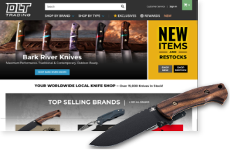
The first priority for a search window is to ensure that it’s easily noticed. For this reason, most sites have the search window in the upper-right corner of the screen. If there is a menu bar or navigation menu headlining the top of the page, the search window will often be in the far-right side of that menu bar.

image2-hero-outdoors-min

In addition to placing the search menu in an important part of the page, it’s equally important to make sure that the search window is visible at all times. It’s critical that pop-ups or other triggered page functions don’t cover the search box when they are activated.

The search box can also be made more visible by highlighting it with a color that’s different from the rest of graphics in the same area of the page. Using a color that also contrasts strongly with the main color scheme will make it even more noticeable.

Another way to enhance the search function for your customers is to allow them to refine their searches. If there is a filter function on the results page, customers can search for items in a certain color, by popularity, or other parameters.

Buyers now expect to be able to search by factors beyond the price, and consumers are accustomed to being able to refine a large batch of search results into smaller groups that give them their desired results. Making a search engine as expressive as possible will go a long way toward improving the customer experience on a site.

icon-square-bullet-point-minMake Your Shop Windows BIG!

An eCommerce site that offers the best shopping experience often has the best sales. Although this may seem like a self-evident truth, it’s important to really think about how the shopping experience affects the shopper’s mood and actions.

Why does a customer shop? Most of the time it’s because they are looking for something. But having an item doesn’t automatically mean that the customer will buy it. If a shopping site doesn’t give the customer a good experience while he or she is in the process of looking at the item, the sale can be lost.

Customers should not have to work to find what they want. In a best case scenario, they should feel as if they are presented with the item they are looking for.

To achieve that effect, ensure that important things are very visible. And because the most important thing is the item itself, make sure the photo of the item is large, attractive, and displays the item well. The name of the item should be very evident as well.

Along with great representation of the targeted item, a savvy eCommerce site will present comparable or buyer-favorite items in smaller windows along the outer periphery of the page. Buyers often click through these windows if they are browsing or if they haven’t yet found what they need.

Just the presence of the alternate choices is enough to stimulate buying. Tracking software shows that exposure of an item in this same page location on multiple pages can significantly increase an item’s sales.quote1-they-should-feel-min

icon-square-bullet-point-minShow Them What You’ve Got

Calls to action are a prime mover for any eCommerce website. But in order for them to be effective, customers have to know what a website offers, and the website has to make it easy for the customer to follow the call to action.

One way to get the customer to act on a call to action is to make the action icon very visually intriguing, as well as having the action icon display clear commands for taking that action.

For instance, for the icon to be noticed, it’s best to use a contrasting color, or at least one that isn’t part of the overall color scheme. It should be large in size, but not so large that it detracts from the appearance of the page.

The text on the call-to-action icon should be short; ideally no more than five words. When you’re creating the text, try to use actions words like “click” or “download” to begin the short phrase.

It’s also a good idea to clearly convey what’s on the other side of the button. Be clear and be concise about what the buyer will find on the next page, and don’t over promise on what you will be delivering.

icon-square-bullet-point-minEasily Accessible Contact Information

Customer trust is always important, but it’s extremely important when money is being exchanged. Consequently, increasing customer trust is another key to increasing sales.

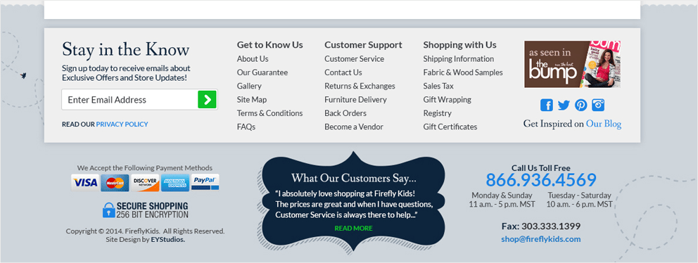
For this reason alone, it’s best to post corporate contact information and/or customer service contact information on every page, perhaps in the footer. Have contact information and access so readily available makes a huge impression on buyers.

If the customers have questions or concerns, getting a quick answer really helps build credibility. It’s also a good payoff to be able to answer any questions that come up during the buying process, so keeping this information front and center in the purchasing process is a big plus. This continual customer support not only improves the usability of the site, it will also improve sales.

image3-firefly-kids-min

icon-square-bullet-point-minEmail Address as a Username

One main method to simplify, and thus enhance, the usability of a site is to use an email address to identify customers instead of requiring the registration of a user name.

This is an easy win. People have unique email names, so why burden the human brain and the worldwide web with one more piece of unnecessary data?

Likewise, it’s so much easier to remember one or even two or three email addresses than several other user names which the customer may or may not recall. It’s better to keep things simple and use email addresses as usernames.

icon-square-bullet-point-minAdvertise Your Security

Your eCommerce site is secure, right? Make sure that your customers know that their shopping experience is protected against internet harm.

Even with today’s high tech protection software, online shoppers still view their online purchases with a hint of suspicion. When an eCommerce site is part of a smaller or unknown company, that fear of being compromised is increased.

Because you want your customers to feel good about ordering from your website, make sure that security badges are on every page, preferably in the footer. You may also want to use them again in another more prominent place on the shopping cart and ordering pages.

icon-phase-two-min

Ordering in the Online Store: Create Credibility with Copy

If there’s one predictable place where the buying process will break down, it’s the ordering process. To prevent this from happening, successful online stores try to answer customer fears and questions before they arise.

How do they do this? By providing clear, concise and reassuring content along with each stage of the buying process.

For instance, on the screen where credit card information is entered, it helps to reiterate security pledges, display their security badge in the body of the page, and add yet one more written reassurance that customer information will not be shared.

Some sites also add an explanation of how the information will be used. Their content states that the details of the customer’s information are used to identify that customer to the site, as well as providing contact information for the website to use in case contact with the customer is necessary.

icon-square-bullet-point-minBuild an Order Process of Several Small Steps

During the process of paying for an item, customers welcome a sense of security and a sense of where they are in the process.

To ensure that customers don’t inadvertently order an unwanted item, many eCommerce sites construct a buying process that’s composed of several smaller actions. During that process, the text and graphics of the site communicate the customer’s progress in the buying process.

Another great aspect of defining the order process in this manner is the ability to use a linear timeline to show the current stage of the process. This timeline is usually shown along the top of the shopping cart pages, and it specifically calls out the present point in the buying procedure.

Using a number of smaller steps instead of one long process also dispels customer fears, because it’s less perplexing and, in the long run, less complex, making it easier for the customer to understand exactly what is happening. Any time money is exchanged in an online transaction, customer satisfaction and confidence are the external facets that affect online businesses the most.

It makes sense that having an easy-to-understand buying process that offers exact and current information will encourage new buyers to go beyond the “I’m only shopping” point.

quote1-customer-satisfaction-min

icon-square-bullet-point-minKeeping the Cart in View

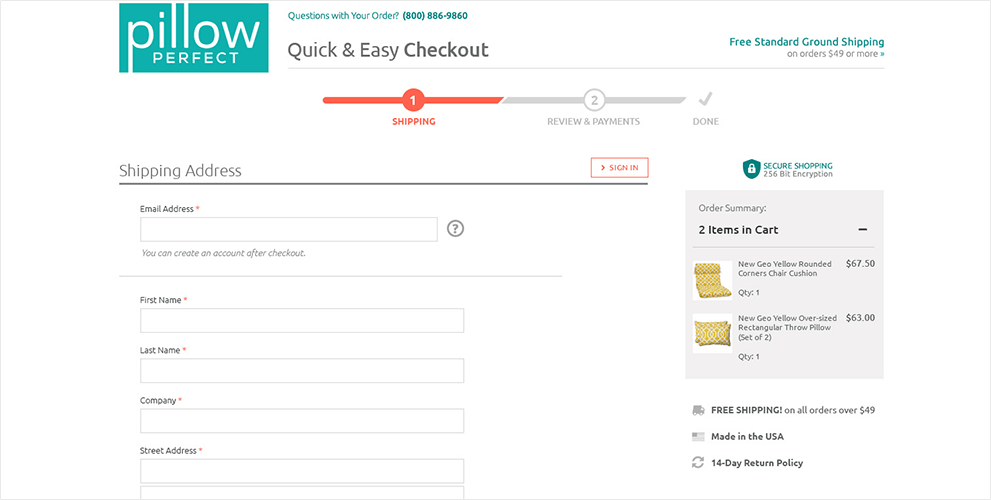
A great strategy for eCommerce stores is to keep the shopping cart visible at all times during the purchasing process. This method keeps customers constantly aware of exactly what is in their cart and the total charges for those items.

The ability to be consistently aware of cart’s contents gives the customer a sense of being in careful control of their shopping. With the cart so obviously present, it’s hard to go to checkout without being notified at least a few times of the present status.

image2-pillow-perfect-min

icon-square-bullet-point-minComplete and Clear Explanation of Shopping Cart Fees

Customer faith and trust can be destroyed in an instant if they feel they are being charged unnecessary or hidden fees.

Because of this, providing clear and obvious explanations of each fee is absolutely necessary for successful eCommerce sites. Large companies are often the best at doing this because they are able to completely explain the various components of the charges and how they are derived.

Corporate giants can’t afford to lose sales because of customer doubts, and neither can small companies. Whether a company is large or small, customer trust is what builds first-time customers and return business.

icon-square-bullet-point-minThe Final Piece

If a buying process is composed of several smaller parts, the final piece must surely be the confirmation page.

The confirmation page is the page that appears very near the end of the buying process. The page should always be headlined as the confirmation page, calling out that this page is the last opportunity to change the shopping cart before finalizing an order.

Having a final confirmation page is unofficially a necessity for all eCommerce stores. Customers who shop with major online retailers have come to expect this feature in all online shopping carts.

Smaller eCommerce sites will be more successful if they keep current with some of the practices of the big retailers, and the confirmation page is a great example of this.

For example, Amazon.com does a great job of encapsulating all of the order information on one final confirmation page. Their page clearly outlines the shipping schedule with the estimated delivery date, the shipping method, and the shipping charges.

This same page also offers the customer a chance to add a gift option, as well as a chance to change the billing method and billing address. In short, Amazon offers its customers comprehensive flexibility to alter their order completely immediately before the order is placed.

Amazon also does an outstanding job of calling attention to the button that must be clicked to actually place the order. This button is located on the upper-right part of the confirmation screen.

In addition to being in a place that’s obvious to the eye, the button was also created using a bright color that stands out against the background.

The text on the button is also very to the point; the button says “Place your order.” And that about says it all, doesn’t it?

icon-square-bullet-point-minUsability as a Selling Point

There’s no doubt that enhancing a site’s usability makes that site more successful, and that’s because usability affects all aspects of a site.

Whether a customer realizes it or not, a site’s usability is often their first major impression of a website. Customers don’t always reason why they like or dislike a site; they simply go with their gut feeling. If navigating the site is not intuitive, they are less inclined to visit it again, no matter how wonderful the selection of products or features.

Creating a smooth and intuitive interface for your eCommerce site should be a top priority in your site design. Having a seamless process in place is one way to keep your customers trusting your site and your products, as well as ensuring they return for repeat business.

Episode 20: Analytics Goals

Listen to “Analytics Goals”

On our most recent episode of EY Access, Eric Yonge speaks to our in-house Analytics Manager Orvin Moore about the importance of setting goals in your analytics.

Here are a few highlights from their discussion:

  • The connection between business goals and analytics goals
  • Specific goals merchants can use
  • Identifying common issues with analytics
  • Steps to take before setting goals

Click the play button below to listen to this episode in your browser:

2016 State of eCommerce: Cart Abandonment and Recapture Statistics [Infographic]

The world of eCommerce is seeing a lot of growth and change. Not only is the number of online retailers growing steadily, but there is a growing list of applications and services that make it easier for the average consumer to comparison shop.

With all the options available, it’s no surprise that only about 1 in 4 customers will actually finish a purchase. That applies to a large majority of online retailers — every business struggles with cart abandonment to some extent.

To put it into perspective, and offer direction on how you can recapture those lost customers, Thunder Bay Media has teamed up with EYStudios to create the following infographic compiling a wealth of data from recent studies.

Check your own data to see how your conversion, recapture, and cart abandonment rates stack up. Be sure to share your findings with me in the comments.

Below the Infographic I’ve included simple tactics you can use to reduce cart abandonment and recapture more of those lost customers.

EYStudios has teamed up with Thunder Bay Media To Present 2016 Cart Abandonment and Recapture Statistics in eCommerce


How to Reduce Cart Abandonment and Improve Conversions

One of the biggest misconceptions is that in order to improve conversions and reduce cart abandonment you need to make dramatic changes to your website and user experience (UX) but that’s not often the case.

In fact, some of the most impactful changes require little more than the time it takes to get them done. It can be beneficial to have a sleek and professionally designed eCommerce store that creates a compelling user experience but you should start with simple changes first to see what kind of an impact you can have.

I recommend starting with these.

1. Wow Your Visitors With Compelling Visuals

When you’re shopping in a brick and mortar store you can pick up a product and physically examine it to decide if it’s what you want. With an online store that experience is completely removed for the consumer.

They’re going to rely on the images as one of the main deciding factors for purchasing a product. Rather than posting an image or two to just get something in place, try some of these tips to help make a better connection with the consumer:

  • Use a quality camera for taking pictures or hire a professional
  • Get a light box kit for taking clean product photos
  • Take pictures from every angle so the customer can see it from all sides
  • Show the product in use and make it look natural, not like a stock photo
  • Upload customer photos showcasing/displaying the product

You can step it up a notch by also adding product videos and you don’t need to spend a ton of money to do it. A professional explainer video with high production value is great, but any video centered on your product will do. According to Treepodia, video provides a significant lift in engagement and conversions.

  • Source videos from your customers, especially testimonial videos showing off the products in use
  • Shoot videos of your team showing off the products
  • Go behind the scenes and upload videos that show the product being manufactured or packaged
  • Use a video that shows the product being slowly rotated

Whether you use images, videos, or both remember to highlight the benefits of your products and try to communicate your value proposition.

2. Write Awesome Product Descriptions

Your descriptions aren’t just a block of text to your customer. That copy builds on the story you tell with your visuals. It’s the most effective way to communicate what they get when they make a purchase and it sets their expectations. It answers the question “Why? What’s in it for me?”

A product by itself with just images tells the consumer absolutely nothing. Even if you list just the specification it doesn’t provide the value proposition. But a detailed product description provides value and information that helps them make that final purchase decision.

You can write better product descriptions by making them rich with information and benefits, and formatting them to make the content easily scannable.

If you’re struggling to find ways to turn features into powerful benefit statements you can always outsource to a freelance content writer who can produce that compelling copy for your products. That has the added benefit of freeing you up to focus on your business.

3. Adjust Your Shipping Costs

From the infographic, you can see that unexpected costs, like shipping, is the number 1 reason people abandon carts. Consumers would rather spend the extra time searching for a retailer with lower shipping costs, and are even willing to pay a bit more for the product as long they don’t have to pay for shipping.

Consider that 93% of consumers stated they would purchase more products if free shipping were available. Major brands are paying attention to this issue, which is why more than 50% of online retailers offer free shipping in some form.

The best approach here is to check your margins and see if you can provide 100% free shipping. If you can’t, or you’re not willing to offer it for free, then consider conditional shipping.

For example: both Amazon and JCPenny offer free shipping once a customer hits a preset dollar amount in the cart.

Whatever route you choose to go, make it obvious early on in the shopping experience so customers know what to expect when it comes time to check out. They’ll be more likely to convert if they see free or reduced shipping well in advance.

4. Leverage Customer Reviews

A study from Nielsen showed that 92% of consumers trust peer reviews over any other form of advertising, and more than 90% of consumers will base a purchase decision on the reviews they’ve read online.

Simply put – make sure reviews are visible on your product pages and are prominently featured.

You should also follow up with every customer after they receive their order, even if it’s through an automated email, asking them to come back and review the product. You’ll get far more reviews with this kind of follow-up engagement.

While you’re moderating the submissions don’t delete low-quality or negative reviews. You can’t make everyone happy and customers will feel like your reviews are fake if each one is a glowing 5-star review. Let those 1-3 star reviews slide. Negative reviews can improve conversions because they make the 4 and 5-star reviews look more authentic.

5. Trust Symbols Matter A Lot

Customers will abandon your site and bail during checkout if they don’t feel like their information is secure. It’s extremely easy to put them at ease by adding a few trust symbols throughout your site. This includes:

  • Clear contact information (phone and email) in the header and footer
  • Extended contact information like a physical address on a “contact us” page
  • SSL/security certificate badges such as Verisign
  • Secure checkout badges, like PayPal and Authorize.net
  • Authentic testimonials
  • Logos for vendor partners and affiliates

6. Improve your Calls to Action

You can make navigation a lot easier for your customers by simplifying your navigation. Your product pages have a lot of information on them so make sure any “add to cart” or other call-to-action button is prominently featured. It should stand out from the page noticeably and use a color scheme different from the content around it to create a strong contrast.

Be sure to use action verbs that focus on the user taking action. Instead of “buy now” use “add to my cart”.

7. Have a Plan for Cart Abandonment Recovery

You’ll always lose a percentage of customers in your checkout, but you should have a plan to recapture the ones who provide you with an email or have an account set up in your system. Even a small percentage of recaptures can lead to a significant lift in revenue. When setting up your abandoned cart email series:

  • Send an email immediately after a cart is abandoned.
  • Send another within a few hours, then the third email within 48 hours. Don’t send more than 3 to avoid being flagged for spam
  • Make sure the email shows off the items they abandoned. Most eCommerce platforms provide scripting for this or do it automatically for you
  • Use a coupon code in the second email to entice them to come back
  • Try to personalize the email so it sounds more genuine and less “automatic”

Another approach is to follow up manually with some of your abandoned carts. Make a real human connection and ask them why they didn’t complete the checkout process. You might just uncover an issue with your cart or processor that needs to be addressed.

Conclusion

Just because every business wrestles with cart abandonment doesn’t mean you have to settle with whatever rate you’re currently achieving. Use the information and tips above and start making small changes to your funnel to improve conversions. Remember to test everything and you’ll begin to see a decline in the number of abandoned carts.

DerekCromwell_GuestBlogger

Derek Cromwell is the founder of Thunder Bay Media, where he provides freelance writing, content marketing, website copywriting, and conversion optimization. When he’s not typing furiously to meet deadlines he enjoys the art of pizza, the outdoors, and being aggressively unfancy. Having given up video games his productivity has increased dramatically!


Sources

Cart Abandonment/Recapture Statistics:

  • On average, 68.63% of shopping carts are abandoned (source)
  • Total estimated value of abandoned carts globally: $4.9 trillion (source)
  • 99% of people won’t buy on the first visit (source)
  • 25% of abandoned carts never return (source)
  • 75% of abandoned carts leave with the intent to return (source)
  • Lower value carts (below $100) have higher abandoned rates than cart values from $100 – $400 (source)

Top Reasons For Cart Abandonment:

  • 44% of carts are abandoned due to high shipping costs (source)
  • 22% of carts are abandoned due to no shipping information available (source)
  • 37% were just browsing (source)
  • 36% found a better price through a competitor (source)
  • 25% felt navigation was too complicated (source)
  • 17% were concerned about payment security (source)
  • 12% due to complicated checkout process (source)
  • 23% due to being forced to create an account (source)

Indirect Causes of Cart Abandonment:

  • A 1-second delay in page load can result in a 7% drop in conversions (source)
  • Too many steps – the average number of steps in a checkout is 5.08 (ideal checkout steps is 3) (source)
  • 50% of websites ask for repeat information (source)
  • Of sites that provide postcode validation, only 12% allow manual override (source)
  • Poor mobile integration – only 4.6% add to cart on mobile compared to 8% on desktop. Mobile conversions average 2.1% compared to 2.8% on desktop. (source)
  • No reviews or reviews seem fake – 92% of consumers trust peer reviews over any other form of advertising (source)

When Are Carts Abandoned:

  • Most carts are abandoned in the evening, between 8 and 9 PM
  • The days of the week with the highest cart abandonment are Wednesday (85%) and Thursday(89%). (source)

Optimization Problems That Kill Conversions:

  • Insecure Checkout or lack of trust signals (VeriSign or security badges, SSL certifications)
  • Not allowing for “guest checkout”
  • Displaying navigation during the checkout process
  • Losing customer input when a submission causes an error
  • Page design and layout conflicts with eye flow
  • Multiple calls to action that conflict or poor calls to action
  • Not displaying visitor progress in the checkout process
  • Requiring unnecessary information or long forms
  • Using cross-sells and up-sells in the middle of the checkout process
  • Not displaying shipping until the end of the checkout

Capturing and Recapturing:

  • 93% of shoppers say they’ll buy more products if they got free shipping
  • 73% of online shoppers noted unconditional free shipping as “critical” to a purchase (source)
  • The average conversion rate for retailers is 3.48% – conversion optimization can as much as triple this rate. (source)
  • 55% of customers use testimonials and reviews as a deciding factor for a purchase be sure to leverage these (source)
  • 72% of snake people are open to retargeting ads (source)
  • The average click-through-rate of retargeted ads is 10x higher than traditional display ads (source)
  • On average, retargeting generates a 1046% lift in branded search, a 726% lift in targeted site traffic, and a 147% lift in conversions. (source)
  • On average, retargeting ads will bring back 26% of users who will complete the checkout process (source)
  • Shoppers are 70% more likely to convert when retargeted after cart abandonment (source)
  • 90% of leads go cold after an hour – send cart abandonment emails right away (source)
  • The average order value of carts recovered using abandonment emails is 58% higher than direct sales (source)
  • 48% of cart abandonment emails are opened. 33.3% of opened emails go on to make a purchase. (source)

It’s Not Too Soon to Consider 4th Quarter Ramp Up

Time to start preparing your eCommerce site for the Holidays!

As the fourth quarter is quickly approaching, it’s time to start thinking about your marketing campaigns. With a blink of the eye Halloween will have passed you by, and Black Friday will be in full swing.

Back to School and Labor Day

It’s time to start focusing your marketing efforts on the back-to-school essentials. Early August is the perfect time to start creating outfits and looks based on the latest trends and incorporate items such as backpacks and lunchboxes into your promotional material. In 2015, 70% of parents said they prefer doing their back-to-school shopping before the August rush hits.

There is no doubt that technology is a vital part of the classroom. This presents a perfect opportunity for tech companies to show why their products should be incorporated into your child’s learning experience. While many retailers are going head to head with their competitive pricing, Jay Brimberry, COO of EYStudios, suggests that merchants create a more emotional buying experience that addresses the feeling of a brand new school year.

Black Friday and Cyber Monday

Research shows that 40% of this year’s sales will happen between the months of September and December. That means your promotional calendar set for Black Friday and Cyber Monday should be the strongest one you put out all year.

A few more things to consider as your site is bombarded with visitors is your hosting and inventory. Are your website servers ready to handle the high traffic demand during peak Cyber Monday times? Hosting companies like, Zerolag, provide managed hosting for high traffic sites with outstanding performance and reliability.

Will your stock levels be adequate to meet the demand of your bestsellers? Red Rook provides order and inventory management solutions, to make sure you never miss a sale.

Tis the Season

For many the 4th quarter is when they receive the most visitors to their site that they have seen all year. This opens up a great opportunity to set goals and track your Google Analytics.

Learning from your site’s performance allows for more effective decision making when updating your site and running future campaigns. If a merchant relies solely on best practices, their conversion rate is bound to suffer. Also by optimizing your conversion funnel, you will be able to aggressively focus retargeting to bring back visitors.

So get ready to get to make the most of the millions of online holiday shoppers this season. Now is the perfect time to start planning your 4th quarter campaigns and drive those conversions!

-Michael Baker
-Marketing

3 Simple Tips to Improve your Magento Site Performance

Magento has been named a resource hog. If you have a server which isn’t able to handle Magento, the site can run a little sluggish. We cannot say this enough, “Get good, sufficient hosting.” However, there are measures a Magento developer can take to help improve performance.

1. Enable Flat Categories and Products

In the Magento admin, navigate to System > Configuration > Catalog > Catalog > Frontend. Set “Use Flat Catalog Category” and “Use Flat Catalog Product” to “Yes”.

Pic 1

See Mage_Catalog_Model_Resource_Product_Collection class below. By doing this setting, you are adjusting how Magento pulls categories and products. It will now pull from the Flat Resource while making the SQL queries simpler.

Pic 2

2. Merge and compress JS and CSS

The following extensions can to compress JS and CSS

We don’t recommend using the built-in JS and CSS merger, because it causes more problems than good.

An excerpt from the article above:

“Magento collates all of the XML layout files and determines which Javascript files should be included for the homepage request. These files are then merged into a single file and saved using an md5 hash of their filenames. This new file, named f0eb853c09ba3e46ad21fb89b8d57626.js, is then served to the user, who downloads it and stores it in their browser cache.

Next, the user clicks a link to one of your categories. Once again, Magento collates the XML layout files and determines what Javascript files are needed for the category page. At this point, Magento realises that the exact same Javascript files used on the homepage are needed on this page.

Instead of remaking the single Javascript file, Magento serves the Javascript file created when the user visited the homepage. This time though, the browser knows that it already has this file and therefore doesn’t download it again. Instead, the file is loaded from the user’s cache, saving time, bandwidth and computer resources!

So far everything has gone well; we have made the page load faster while decreasing the load on the server. Next, the user is enticed by one of your products and clicks through to a product page.

Once again, Magento determines which Javascript files are needed based on the layout XML files. At this point, Magento realises that the same Javascript files on the homepage are needed as well two new files. As a merged file containing this combination of Javascript doesn’t exist, Magento merges the files and creates a new Javascript file named 139f9771ba2ba0cae754978fab4a3c35.js.

Roughly 80% of this file is the Javascript that was used on the homepage and has been downloaded and cached by the user already. The final 20% accounts for the new Javascript files used solely on the product page. This file is then served to the user who is forced to download it all! Although this file is made of 80% code that has already been cached, the user’s browser is completely unaware of this and will download 100% of the file and cache it again!”

When moving JavaScript files to the footer, use this extension.

3. Enable Full Page Cache (FPC)

If you are on Community Edition, use one of the extensions below

Enable other caching

  • Cache backends: Memcache or APC
  • Session stores: Memcache or Redis
  • OpCode cache: APC or XCache
  • Reverse Proxy Cache: Varnish

Kornchai_Blog


Runway: Not Your Agency’s Retainer Service

EY’s Runway program has exploded in the last year. Learn why it’s become the must-have service of our top clients.

If you’ve worked with or shopped around any sort of traditional agency, you’ve heard it, the R-word. Retainer. But what does that mean? It isn’t just that thing your mom paid for after your braces came off, that you never wore and eventually threw away on accident.

Retainers at a traditional agency are usually paid monthly, and are established as a percentage of a company’s total marketing plan, while any projects are billed separately at an hourly rate. Large companies with vast marketing budgets accept retainers as a fact of life, and know to retain a valuable and talented agency, they’re a must have.

However, for a lot of the small businesses that we work with, they’re a little intimidating. Clients often tell me they want to avoid recurring payments and ongoing commitments if at all possible. Their businesses are streamlined, and overhead needs to be cut anywhere possible.

So why EY’s version of the retainer program, Runway, grown from 3 clients to 20+ within the last year?

You get what you pay for, literally.

Runway clients pick a package of hours that works for their needs as small as 10 hours a month, and as big as 50 hours a month or more. Those hours are then applied directly to design, development and analytics deliverables that our clients need. The Runway Consultant’s time and knowledge are available to our clients no additional charge. What other industry does that? None that we know of.

You’re a priority in our production queue.

Runway clients experience a turnaround time on their items of 2 to 3 business days, whereas normal requests coming through the Studio can expect a 5 to 7 business day turnaround. That being said, Runway clients also reserve the right to have the occasional same-day-turnaround emergency. We will do everything in our power to meet your deadlines and exceed your expectations when it comes to production timing.

No invoicing hassles AND a discounted hourly rate

Normal requests coming through the studio have to get quoted, invoiced, and then get put in the production schedule. Runway clients pay for their hours up front at the start of the month, and then we track what you use, and what you have left. You only pay for the time that you use, and the best part is, Runway clients get a discount on our hourly rate. The longer the commitment, the more you save.

Expert knowledge, always on call

Think of our Runway Consultants as eCommerce experts who are at your disposal. Wouldn’t it be nice to know what other merchants are doing? What the new technology is? Let us be the experts in our industry, so you can continue to focus on yours.

In addition to Monday through Friday availability, Runway Consultants are on call for their clients. What does that mean? A real cell phone number, and someone to assemble the troops should an emergency occur after hours. When was the last time you could count on that level of service?

So when you’re thinking of how to take your business to the next level, think of Runway.

Meagan_headshot_PROOF

-Meagan Bryson
-Director of Client Service

Episode 19: The Importance of Analytics

Listen to “The Importance of Analytics”

On our most recent episode of EY Access, Eric Yonge and Orvin Moore discuss the importance of correctly setting up Analytics for your store.

Here are a few highlights from their discussion:

  • Setting up Analytics correctly
  • Creating Multiple Views
  • Enabling important settings
  • Correctly linking other Google products
  • Benchmarking

Click the play button below to listen to this episode in your browser:

Unlock Your Site’s Potential With This Simple Google Analytics Feature

Analytics is an important tool to help inform you of what is happening on your site, now AND to provide you with new opportunities to explore through discovery. “But where do I start?” That’s a question that I hear way too often and that is because many are unaware of the many simple but effective features Google Analytics offers that can help to unlock the full potential of their site. There are dozens of these features that I have found to be extremely helpful, but for now, I’ll only focus on one of them: Goals!

What are goals? Goals measure how well your site fulfills target objectives. Some examples of goals you could have on your site are:

  • An order completion
  • The submission of a contact form
  • Video plays
  • PDF downloads
  • Time spent by a user on a specific blog post

Goals allow you to track how users are interacting with your site within a session. Find out how engaged your users actually are and use it to inform your marketing decisions.

Here are a few simple steps to follow to set up a goal and get started with Google Analytics!

  1. Admin

1

  1. Goals

2

  1. + NEW GOAL

3

  1. Choose a goal (template or custom)

4

  1. Choose a Goal Description and select a Goal Type

5

  1. Provide goal details.

If necessary or wanted, create a funnel to see how a user progresses along the path to this goal.

6

  1. Verify (test) your goal setup.

7

By tracking your goals you can better understand the needs of your site’s visitors. This information can be incorporated into marketing campaigns, and put you in front of your desired audience.

Our next blog will take a deeper dive into capitalizing on your site’s data by utilizing heat mapping. Stay tuned!

Orvin_Blog

Contact Us