Although good usability is important for every website, it’s especially critical for an eCommerce website. If an eCommerce site isn’t easy for potential customers to use or navigate, it won’t generate as many sales as it would if it were easier for customers.
ECommerce sites are susceptible to becoming overly complex mainly because of the sites’ purposes. Purchasing is a complex process; customers interact with a variety of interfaces involving shopping carts, billing, credit cards, shipping addresses, plus the secure checkout system – and that’s just a few of the features common to most eCommerce sites.
Good usability is a definite requirement for a successful eCommerce site. If a customer can’t complete the purchasing process because it is too long and complicated, or if they don’t feel their personal information is secure, it doesn’t matter if great prices are being offered or if the products are amazing.
When considering usability for eCommerce sites, there are two distinct phases of the shopping process. The first phase is choosing the product, and the second phase is buying it.
Let’s take a look at the first phase – choosing the product.
![]()
Shopping in the Online Store: Taking a Lesson from Hansel and Gretel
You remember that old fairy-tale about the two kids in the woods, Hansel and Gretel? They dropped breadcrumbs behind themselves so they could find their way home.
Shopping sites use digital breadcrumbs in the same way. As a customer clicks through different points on a site, a “trail” of digital breadcrumbs will appear at the top of the screen, showing the path they have followed to reach their current point. A great example of this is the Amazon website, which uses digital breadcrumbs very effectively.
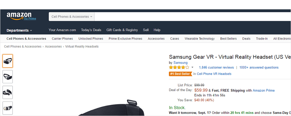
It’s so important for a customer to continually be aware of their location when shopping online. In the shopping process it’s very easy to get sidetracked by reading reviews or by checking out other similar products.
Having the path to the current page outlined at the top helps customers keep track of their shopping and can also help them find comparable products in related categories.
 No-Stress Search Function
Many people don’t like to use a navigation menu to find the items they are looking for, even if the navigation menu is very well designed. Most folks prefer to use a search window to find an item or perhaps to window shop for a whole group of items.
A search field that is easy to find and easy to use can really encourage or promote more sales. After all, a customer must be able to find a product before they can buy it.
The first priority for a search window is to ensure that it’s easily noticed. For this reason, most sites have the search window in the upper-right corner of the screen. If there is a menu bar or navigation menu headlining the top of the page, the search window will often be in the far-right side of that menu bar.

In addition to placing the search menu in an important part of the page, it’s equally important to make sure that the search window is visible at all times. It’s critical that pop-ups or other triggered page functions don’t cover the search box when they are activated.
The search box can also be made more visible by highlighting it with a color that’s different from the rest of graphics in the same area of the page. Using a color that also contrasts strongly with the main color scheme will make it even more noticeable.
Another way to enhance the search function for your customers is to allow them to refine their searches. If there is a filter function on the results page, customers can search for items in a certain color, by popularity, or other parameters.
Buyers now expect to be able to search by factors beyond the price, and consumers are accustomed to being able to refine a large batch of search results into smaller groups that give them their desired results. Making a search engine as expressive as possible will go a long way toward improving the customer experience on a site.
 Make Your Shop Windows BIG!
An eCommerce site that offers the best shopping experience often has the best sales. Although this may seem like a self-evident truth, it’s important to really think about how the shopping experience affects the shopper’s mood and actions.
Why does a customer shop? Most of the time it’s because they are looking for something. But having an item doesn’t automatically mean that the customer will buy it. If a shopping site doesn’t give the customer a good experience while he or she is in the process of looking at the item, the sale can be lost.
Customers should not have to work to find what they want. In a best case scenario, they should feel as if they are presented with the item they are looking for.
To achieve that effect, ensure that important things are very visible. And because the most important thing is the item itself, make sure the photo of the item is large, attractive, and displays the item well. The name of the item should be very evident as well.
Along with great representation of the targeted item, a savvy eCommerce site will present comparable or buyer-favorite items in smaller windows along the outer periphery of the page. Buyers often click through these windows if they are browsing or if they haven’t yet found what they need.
Just the presence of the alternate choices is enough to stimulate buying. Tracking software shows that exposure of an item in this same page location on multiple pages can significantly increase an item’s sales.
 Show Them What You’ve Got
Calls to action are a prime mover for any eCommerce website. But in order for them to be effective, customers have to know what a website offers, and the website has to make it easy for the customer to follow the call to action.
One way to get the customer to act on a call to action is to make the action icon very visually intriguing, as well as having the action icon display clear commands for taking that action.
For instance, for the icon to be noticed, it’s best to use a contrasting color, or at least one that isn’t part of the overall color scheme. It should be large in size, but not so large that it detracts from the appearance of the page.
The text on the call-to-action icon should be short; ideally no more than five words. When you’re creating the text, try to use actions words like “click” or “download” to begin the short phrase.
It’s also a good idea to clearly convey what’s on the other side of the button. Be clear and be concise about what the buyer will find on the next page, and don’t over promise on what you will be delivering.
 Easily Accessible Contact Information
Customer trust is always important, but it’s extremely important when money is being exchanged. Consequently, increasing customer trust is another key to increasing sales.
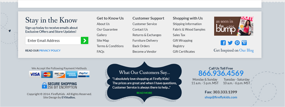
For this reason alone, it’s best to post corporate contact information and/or customer service contact information on every page, perhaps in the footer. Have contact information and access so readily available makes a huge impression on buyers.
If the customers have questions or concerns, getting a quick answer really helps build credibility. It’s also a good payoff to be able to answer any questions that come up during the buying process, so keeping this information front and center in the purchasing process is a big plus. This continual customer support not only improves the usability of the site, it will also improve sales.
 Email Address as a Username
One main method to simplify, and thus enhance, the usability of a site is to use an email address to identify customers instead of requiring the registration of a user name.
This is an easy win. People have unique email names, so why burden the human brain and the worldwide web with one more piece of unnecessary data?
Likewise, it’s so much easier to remember one or even two or three email addresses than several other user names which the customer may or may not recall. It’s better to keep things simple and use email addresses as usernames.
 Advertise Your Security
Your eCommerce site is secure, right? Make sure that your customers know that their shopping experience is protected against internet harm.
Even with today’s high tech protection software, online shoppers still view their online purchases with a hint of suspicion. When an eCommerce site is part of a smaller or unknown company, that fear of being compromised is increased.
Because you want your customers to feel good about ordering from your website, make sure that security badges are on every page, preferably in the footer. You may also want to use them again in another more prominent place on the shopping cart and ordering pages.
![]()
Ordering in the Online Store: Create Credibility with Copy
If there’s one predictable place where the buying process will break down, it’s the ordering process. To prevent this from happening, successful online stores try to answer customer fears and questions before they arise.
How do they do this? By providing clear, concise and reassuring content along with each stage of the buying process.
For instance, on the screen where credit card information is entered, it helps to reiterate security pledges, display their security badge in the body of the page, and add yet one more written reassurance that customer information will not be shared.
Some sites also add an explanation of how the information will be used. Their content states that the details of the customer’s information are used to identify that customer to the site, as well as providing contact information for the website to use in case contact with the customer is necessary.
 Build an Order Process of Several Small Steps
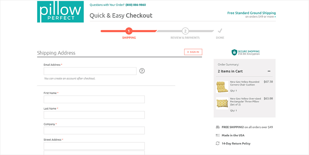
During the process of paying for an item, customers welcome a sense of security and a sense of where they are in the process.
To ensure that customers don’t inadvertently order an unwanted item, many eCommerce sites construct a buying process that’s composed of several smaller actions. During that process, the text and graphics of the site communicate the customer’s progress in the buying process.
Another great aspect of defining the order process in this manner is the ability to use a linear timeline to show the current stage of the process. This timeline is usually shown along the top of the shopping cart pages, and it specifically calls out the present point in the buying procedure.
Using a number of smaller steps instead of one long process also dispels customer fears, because it’s less perplexing and, in the long run, less complex, making it easier for the customer to understand exactly what is happening. Any time money is exchanged in an online transaction, customer satisfaction and confidence are the external facets that affect online businesses the most.
It makes sense that having an easy-to-understand buying process that offers exact and current information will encourage new buyers to go beyond the “I’m only shopping” point.

 Keeping the Cart in View
A great strategy for eCommerce stores is to keep the shopping cart visible at all times during the purchasing process. This method keeps customers constantly aware of exactly what is in their cart and the total charges for those items.
The ability to be consistently aware of cart’s contents gives the customer a sense of being in careful control of their shopping. With the cart so obviously present, it’s hard to go to checkout without being notified at least a few times of the present status.
 Complete and Clear Explanation of Shopping Cart Fees
Customer faith and trust can be destroyed in an instant if they feel they are being charged unnecessary or hidden fees.
Because of this, providing clear and obvious explanations of each fee is absolutely necessary for successful eCommerce sites. Large companies are often the best at doing this because they are able to completely explain the various components of the charges and how they are derived.
Corporate giants can’t afford to lose sales because of customer doubts, and neither can small companies. Whether a company is large or small, customer trust is what builds first-time customers and return business.
 The Final Piece
If a buying process is composed of several smaller parts, the final piece must surely be the confirmation page.
The confirmation page is the page that appears very near the end of the buying process. The page should always be headlined as the confirmation page, calling out that this page is the last opportunity to change the shopping cart before finalizing an order.
Having a final confirmation page is unofficially a necessity for all eCommerce stores. Customers who shop with major online retailers have come to expect this feature in all online shopping carts.
Smaller eCommerce sites will be more successful if they keep current with some of the practices of the big retailers, and the confirmation page is a great example of this.
For example, Amazon.com does a great job of encapsulating all of the order information on one final confirmation page. Their page clearly outlines the shipping schedule with the estimated delivery date, the shipping method, and the shipping charges.
This same page also offers the customer a chance to add a gift option, as well as a chance to change the billing method and billing address. In short, Amazon offers its customers comprehensive flexibility to alter their order completely immediately before the order is placed.
Amazon also does an outstanding job of calling attention to the button that must be clicked to actually place the order. This button is located on the upper-right part of the confirmation screen.
In addition to being in a place that’s obvious to the eye, the button was also created using a bright color that stands out against the background.
The text on the button is also very to the point; the button says “Place your order.” And that about says it all, doesn’t it?
 Usability as a Selling Point
There’s no doubt that enhancing a site’s usability makes that site more successful, and that’s because usability affects all aspects of a site.
Whether a customer realizes it or not, a site’s usability is often their first major impression of a website. Customers don’t always reason why they like or dislike a site; they simply go with their gut feeling. If navigating the site is not intuitive, they are less inclined to visit it again, no matter how wonderful the selection of products or features.
Creating a smooth and intuitive interface for your eCommerce site should be a top priority in your site design. Having a seamless process in place is one way to keep your customers trusting your site and your products, as well as ensuring they return for repeat business.

