


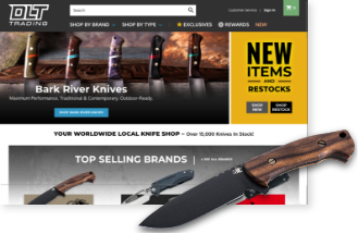


Usability mistakes involving eCommerce category structures are among the most common that we see here at EYStudios. It’s usually either one extreme or another regarding Top Level Categories. We usually give them the acronym “TLC” (which doesn’t mean “tender loving care”—but we still really care about them, and you).
If proper organization was related to temperature, these extremes are either scalding hot or bitterly cold. Although there’s one other that’s ridiculously lukewarm. Avoid all three at all costs, or it’ll cost you conversions.
Too Hot: Overcomplicating TLC
I often encounter stores with less than 100 products featuring a menu with almost a dozen categories. While an argument could be made for that many classifications, it more often than not creates a needlessly complex structure. When a customer must focus on that many choices up front, the payoff needs to be worth it.
Simply put, a high number of TLC needs to result in a high number of respective products. Have you ever clicked on a category, only to find a single product inside? Again, while this is sometimes necessary, it usually is not. It’s usually evidence of how that product needs to be packaged into a more intuitive category.
Too Cold: Oversimplifying TLC
On the other end of the spectrum, I see merchants bundle everything together into a single “SHOP” button. If you’re doing that, you better have more categories than you could ever consolidate into a desktop view of your top navigation. In other words, you need to have many thousands of products on the level of a Home Depot or Amazon. These are sites that merchants often admire, but their inherent navigation doesn’t apply to the average eCommerce store.
Because design shops and template manufacturers know merchants like these stores, they will create layouts that feature the ubiquitous “SHOP” flyout. The problem becomes two-fold in that:
- It forces an unnecessary click to show any resulting sub-categories.
- The consolidation removes any additional visual cues or merchandising opportunities. This is because basic text links are the only viable presentation option.
Lukewarm: The dreaded “MORE” option!
That’s right, we’ve all seen it before. You’ll read a series of TLC and then all of a sudden a generic “MORE” will be on the tail-end! This is a generic catch-all category that works great for merchants because it acts as a landfill for any annoying sub-category you don’t want to spend time figuring out a home for. Just dump it into the “MORE” category and call it a day!
The problem is that no one likes spending time in a landfill. You’re forcing customers to distinguish between options that usually have zero correlation to each other, and it becomes an absolute chore. Nothing like trying to boost up your user experience than by sending customers to landfills.
—
So what is the solution if neither of the TLC extremes or the lukewarm landfill option can work for your store? Well, the true answer is that it takes careful consideration of your store’s individual product DNA to present an intuitive map that customers will want to use. This is one of our specialties at EYStudios, so reach out if you need any help. We’ll even throw in some extra tender loving care while we’re at it!
