One of the common e-commerce UX buzzwords is the “customer journey.” This sounds exotic and cool, but what exactly does that mean? More importantly, how do we optimize around this customer journey?
To begin defining the journey, we first must center around where it ends. In the case of e-commerce, this always means a successful cart purchase. Working our way back, there are three common “entry points” for a consumer: Homepage, Section Page and Item Page.
Let’s examine the customer journey from each of these three entry points:
Homepage
We know that every journey doesn’t begin with the homepage, but it is obviously still a key layout in your site design.
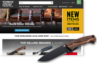
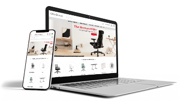
Depending on the way the homepage is designed, it can promote key category sections as well as featured items. You can see this listed in the infographic above. The layout construction is critical to make sure the journey to those respective pages is one worth taking.
The homepage is meant to provide a visual summary of your product and brand so that it provides intuitive segmentation. In other words, a customer must recognize something very specific or very general to warrant a click. If merchants get this merchandising dynamic wrong, it will, unfortunately, communicate the sections and individual products do not warrant further interest.
The way to fix this is to design your merchandising graphics to center around sections that generate a lot of interest. Make sure the product featured in these graphics are enticing representations. Lastly, make sure the content and call-to-action buttons are clear and concise.
If you do include featured items, look for creative ways to link back to the parent section as well. Someone might not see the exact screwdriver they want, but they might want to browse the parent screwdriver section.
Section Page
When a customer enters your site through a section page, this presents a unique opportunity to propel them further into the journey.
We first need to determine if we’re talking about a top-level category (TLC) or subcategory page. In the latter case, it is expected for customers to see a row of product thumbnails accompanied by some type of filtering.
However, TLC can and should have a different layout than subcategories. When they are the exact same (which is often the case), it creates a boring experience that can also be confusing.
Depending on the amount and type of products you sell, TLC can present fantastic opportunities to merchandise items in a more specific manner. Most merchants depend on the homepage to do all of the heavy lifting, but TLC can be viewed as departmental landing pages — essentially, mini homepages.
Getting creative with TLC pages takes the same lessons learned above on homepages, but then you can fine-tune that logic. Now you’re able to graphically promote sub-sections and featured items with more precision.
Even if your product mix demands a type of layout that forgoes fancy merchandising, you should see TLCs as an opportunity to drill down in a creative manner. No matter what, sub-categories should always be treated differently on a thumbnail level from individual products.
Finally, don’t miss the fact that customers on a section page may backtrack to the main homepage. This gives them a chance to recalibrate themselves to your overall brand. In that instance, the homepage’s responsibility to present a general summary is even more critical.
Item Page
When a customer enters through the item page, it’s important to remember that there is no branded communication about the company or categories. At this point, all broad merchandising has taken a backseat to specific product details, along with upsell and cross-sell opportunities.
This may be enough for a customer to add a product to their cart and proceed directly to the checkout, as the infographic shows. However, they may also want to re-orient themselves, which means backtracking to the homepage or section page.
Making sure the item page is designed with a clear Add to Cart and smart use of product options and details is vital to continuing to checkout. Avoid useless distractions that clutter the overall experience. This is the make-or-break layout that determines if something is going into the cart or not.
I highlighted before how backtracking from the section page increases the heavy lifting of a homepage. This is magnified when a customer enters through the item page. It’s like coming into the middle of a movie and deciding it’s worth watching from the beginning or finishing from where you originally started.
—
Any customer’s journey can be unique as their own preferences. However, it is wise to have a strategic usability approach to maximize these three main layouts buyers interact with on that path. If you need a fresh look at how your homepage, section page, and item page are performing, let us know!


